latest
Google announces Material Design Award winners for 2021
Google has announced Material Design Award winners for 2021, spanning three categories -- best dark theme, large screen adaptation, and motion design.

Google has announced the results of its seventh annual Material Design Awards, commemorating three apps that create great experiences using its Material Design guidelines. This year's awards cover three categories -- the best large screen adaptation, best dark theme implementation, and the best motion design. Here are the winners of this year's Material Design awards.

This week in Tech: Android 12L, new mid-range Qualcomm chips, Facebook rebranding, and more
This week in tech, Google announced Android 12L, Qualcomm introduced four new mid-range chips, Facebook changed its name, and more!
After last week's frenzy, this week in tech was a little relaxed. Even then, we saw a few significant announcements, like Google announcing Android 12L, Qualcomm releasing four new mid-range chips, and Facebook changing its name. If you missed any of our coverage, here's a brief recap of all the noteworthy developments in the tech world this week.

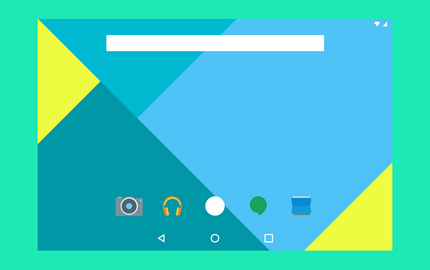
Google has evolved its Material design language ever since its introduction in Android 5.0 Lollipop, and in recent years, the company has been moving towards a flatter and more monochrome design. Today at Google I/O, an updated version of Material Design was announced with a focus on customization, called 'Material You'.
Graphic design for Android developers: Creating the ideal app icon
Creating product icons isn’t as hard as it might seem at first glance. Find out more about designing your first Android app icon from scratch!

No matter what marketplace or service an app is distributed through, its app icon is the first thing a prospective user would notice. First impressions are of paramount importance when trying to reel in new users, which means that icons are key components of any application. And, regardless of the intent of the app, creating a beautiful application icon should be an important part of every app’s development phase. Although many developers of technical applications leave the graphics to dedicated designers, understanding the fundamentals of design and applying them is something anyone can do, given a knack for experimentation and analysis. App icons are no exception!
Google Pay (Tez) for India gets a Material Theme redesign
The Indian version of the Google Pay app (formerly know as Tez) is now receiving a Material Theme-based redesign fitting Google's aesthetic. Check it out!
Google recently attempted to unify all of its payment services and payment solutions, which included services formerly called Android Pay and Google Wallet, under a single umbrella: Google Pay. This unification included local solutions: Google Tez, an India-only payment service based on the UPI system, was also rolled into Google Pay. As you can guess, though, the Indian version of Google Pay has very little to do with the Google Pay you can find in the rest of the world, but that doesn't mean it can't receive love from Google. Now, the Google Pay for India app is receiving a Material Theme-based facelift for a change.

The fall and rise of Roboto, Android’s default font
Roboto has gone from being a oft-criticized font element from Google, to one of the better design decisions on Android. See how the font has progressed!
It’s easy to overlook the importance of typefaces in software design, especially when it comes to designing graphical user interfaces. Sadly though, even the best typefaces ever created, including Helvetica (arguably the most popular no-frills typeface ever created), would turn to mush if they were scanned and used on computers as-is, the way they were created for print. Good operating system GUIs, especially those that power smartphones, require fonts that resize fluidly and are readable and appealing, no matter whether used in tiny battery meters or in blown-up homescreen widgets; and to make a typeface that’s recognizable on every such scale on a digital screen is no more a practical impossibility. Adobe managed to do this with the Source Pro family of fonts, Apple created San Francisco, and Google came up with Google Sans and Roboto. What’s even more commendable, though, is that the latter slowly became a favorite for amateurs and professionals alike, being sported everywhere from magazines to billboards due to its libre nature.

[Update: Rolls out next week] Hands-on with Google Drive's new Google Material Theme redesign
Google is testing a redesign of the Google Drive app using their new Google Material Theme design. Here are screenshots of how it'll look.

At this year's Google I/O developer conference, Google unveiled the Material Theme tools to aid developers in designing UIs that match their brand while incorporating elements of Material Design. Google’s own Material Theme design makes liberal use of light colors, cards, and rounded corners. So far, Google Calculator, Google Photos, Google Chrome, Android Messages, Google Phone, Google Contacts, and Google Calendar have received updates with new Material Theme redesigns. Google teased the upcoming redesign for Google Drive, and now we have our first hands-on of the latest design for the Drive app.

Google wants developers to add dark themes to save battery life
At Google's Android Dev Summit, Google started advocating for developers to implement dark themes, in an effort to save battery life.
There are many different reasons why a big chunk of our readers loves dark themes. They're more aesthetically pleasing, they're easier on the eyes, and when done right, and under the right conditions, they might even save some battery. These are just a handful of reasons why dark Substratum themes populate the Play Store---as most apps out there keep chasing an all-white look, a dark UI becomes the better, friendlier option, and Substratum allows you to go for a dark look on every one of your apps. More recently, Google has also started to take a friendly approach to dark themes.

Download: Google Keep Notes with revamped Google Material Theme
Google Keep Notes is the latest Google application to receive a new UI based on the Google Material Theme design guidelines.
We first heard about a revamp to Google Material Design back in February referencing the redesign of Android's design language. The refresh was officially announced at Google I/O 2018. The Material Theming tools allow any brand to create their own style of Material Design. Google's Material Theme has rolled out to Google Photos, Google Drive, Android Messages, Google Phone, Google Calendar, Contacts, Google Calculator, and Chrome. But, there are still a few applications left to receive the new design. One of those apps was Google Keep, which was recently renamed to Keep Notes.

Google Play Games tests new leaderboard design & other UI changes
Google Play Games is testing a redesign of the leaderboard and multiplayer window. The design uses the new Material Theme guidelines.
Google is testing a new user interface for the Google Play Games leaderboard and multiplayer window. The menus are getting the new Material Theme interface that has been rolling out to apps. This adds the new light color design and updated font.

Android Messages' new Material Theme design with Dark Mode rolls out
Android Messages has received a new Material Theme design with Dark Mode, and it's rolling out now. You can install it early if you want!

Google has released the new Material Theme redesign for the Android Messages application in version 3.5.048 to all users. We discovered how to enable it way back in version 3.3 when it was first added as a hidden option, but now it's rolling out to all users. It's not just a completely rejigged UI, but the inclusion of a brand new dark mode as well.
Google Phone 23 rolls out Material Theme redesign to match Google Contacts
Google is rolling out a Google Phone redesign in the latest beta, based on Google's new Material Theme guidelines, following the Google Contacts update.
The newest iteration of the Material Design guidelines, known as "Material Theme" or more colloquially "Material Design 2" has generated mixed opinions among Android enthusiasts. On one hand, some appreciate the simplicity in its design, incorporating new elements or changing existing ones without losing the "Material" essence. Others criticize it heavily for borrowing bits of iOS theming with lots of white. Love it or hate it, Google is rolling out their updated design language to all their applications and service, and we may see most, if not all, Google apps already updated by the time the Google Pixel 3 is announced. We previously reported that Google rolled out this design update for Google Contacts just a few days back, and we're now getting a Google Phone Material Theme redesign as well.

Google Contacts 3.0 gets a new Material Design theme
The Google Contacts app has received a facelift inspired by Google's newest Material Design guidelines in its latest version.
The first thing you'll notice after your phone gets updated to Android Pie is its significant UI refresh, which is based on the newest Material Theme guidelines (commonly referred to "Material Design 2"). Love it or hate it, Google is updating their entire apps and services suite to fit these new guidelines which adopt elements such as clear, vibrant colors and rounded corners across the whole interface. Google Maps recently received a makeover based on these new Material Theme elements, and we've already gotten a glimpse on how will they look on apps like Android Messages and desktop/mobile Google Chrome. The latest app to receive a facelift is Google Contacts, and it's quite beautiful.
Enable Google Chrome's new design with one Chrome flag
Google Chrome is undergoing major design changes. The Material Design revamp is still quite a bit away but for those of you who are interested in trying out all of Chrome's new design, there's a new Chrome flag that will enable all of the features.
The Google Chrome browser is open source, so we can track progress on its development quite easily. We've seen how Chrome is getting more optimized for touchscreen devices like the HP Chromebook X2 and the Acer Chromebook Tab 10, how a major Material Design revamp is underway, and how Chrome OS is receiving Android P-esque user interface changes. We cover the most interesting new Chrome flags that we discover, but it can be annoying having to dig around and enable multiple flags just to test all of the latest features. Google will be making that easier for us by consolidating all of Google Chrome's new design behind one Chrome flag.

Google's Material Design UI is Getting Revamped with New Colors, Iconography, and a Focus on Touch
New commits in the Chromium Gerrit appear to reference "Material Design 2", which might be a new and improved version of Google's Material Design language.
Material Design, the unified design language that launched alongside Android Lollipop, features flat, pastel color palettes, depth, soft lighting, and realistic physics. It's meant to mimic the tactility of real-world objects without resorting to skeuomorphism; Google describes it as a synthesis of "classic principles" with "[the] innovation and possibility" of technology.

Material Notification Shade Adds Customization Options to your Notification Shade
Material Notification Shade replaces your stock notification shade and adds a ton of customization features including multiple themes.
Material Notification Shade is an application that uses gesture-detection to overlay the generic notification shade with a more configurable one. This app doesn't actually override any parts of the original notification shade implementation so the original is still there—just hidden underneath this app.

Many users are enhancing their audio experience with ViPER4Android and this popular application has been pleasing our ears for years. Unfortunately, its user interface is a bit outdated.
Unstable Material & Inconsistency in Design
In this editorial we explore some of the inconsistencies in Material Design and how they impact our Android experiences. Is Lollipop consistent enough?
One thing that was a source of criticism towards Android for years was the appearance of its UI. While each iteration brought newer and more modern elements to the interface, the biggest changes were arguably made in the past few versions. Design languages like HOLO and Material Design have distinct looks that set them apart from the competition. Whilst many manufacturers want their interface to resemble popular models (like several Chinese OEMs and their themes “inspired” by Apple), Google and its snazzy-dressed designer Matias Duarte made a daring jump with Material Design.

Easily Generate and Export Material Design Palletes
Material Palette is a new website which makes it easy to generate and export color palettes in Material Design.
For many people, it can be pretty difficult to create a palette of complementary colors. That said, having one available can be quite useful when creating an application, theme, wallpaper, or any kind of concept. Choosing the right shades of colors for the different elements of your work isn't easy, so unless you’re a gifted designer, you’re probably going to need a bit of help. This is where Material Palette comes in.